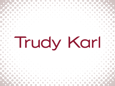
Personal Branding – Tech Round 2
Thanks to feedback from @Ronnie Sampson and @Chuck Spidell, I made some edits... tightened kerning between the T & r, converted the a to be similar to the d, ever so slightly lengthened the l without it looking taller than the other letters (yes, Ronnie, it did look shorter, maybe the optical illusion of having it hang out there all by itself? I still wondered about this edit—shouldn't it be the same length as the d?), kerned the a and the r some more, and added a very, very fine rounded stroke to thicken it all up, forcing me to kern it all again. Thank you to you both. STILL, any other suggestions by anyone is most appreciated. This is such a departure from my previous direction (branding for my art and illustration), but maybe with the curving it up a bit, could still work for those, even. This will be used for my portfolio, so needs to stay clean; I am resisting adding all sorts of fun stuff to it.

