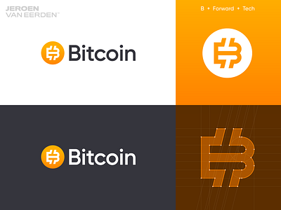
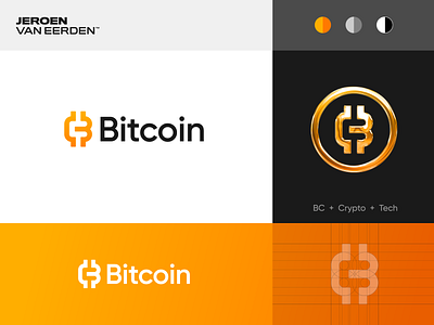
Bitcoin - Logo redesign ₿ v3
Logo redesign for Bitcoin ₿ - Part 3
It's been much fun to explore these logo concepts for a potential bitcoin logo redesign. Out of all buy concepts, I think this version feels most solid. I just love the flow this monogram has, and still holds all the elements which I wanted to have it. The idea of including the 'c' in previous concepts was eventually not that much needed in my opinion and this more 'simplified' and connected version works great as a standalone too.
What do you think? Yay or Nay?
Interested in working with me?
Lets make a mark together:
More by Jeroen van Eerden View profile
Services by Jeroen van Eerden
Like

