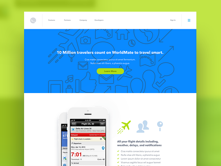
Worldmate Rejected Design
Made a lot of different directions for this project, but i was always fond of this direction in particular for it's color use(and avenir). Also icons! lots of icons.
More by Bright Bright Great View profile
Like
