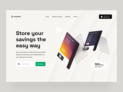
banking: web design
Good humpday to you, visual lover. You may lose one thing, but then gain something great.
This game of contrasts finds its meaning across the whole world, as well as in finance. So for the banking theme, I went with creating a solution that's a bit complex, but simple, like easybank. By combining a bright gradient with neutral-looking waves, I tried to convey the growth and change found in any business.
Craving to hear your thoughts on this!
Want to know more about Heartbeat and take a peek behind the scenes? Visit our website for case studies or follow us on Instagram for daily office life pics.
More by heartbeat View profile
Like
