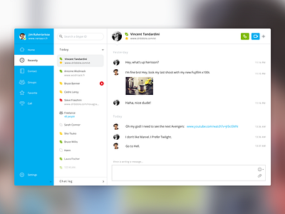
Skype Redesign
Last week, I made a redesign for Skype to improve accessibility and experience of chat for Mac & PC. And I discover the excellent work of Pijus Aleksandravičius :
https://dribbble.com/shots/1516298-Skype-re-design-concept
His version is similar than my 1st version :
https://dribbble.com/shots/1517895-Skype-Redesign/attachments/229260
But his color scheme is really better. It's more appropriate for the Skype brand.
So, I made a new version with my ui and his color scheme. I splitted the app into 3 parts:
- Type of chat
- Friendlist/Group list/Favorite list
- Chat window
The objective is to provide a simple and quick access to each feature of Skype.
More by Jimmy Raheriarisoa View profile
Like


