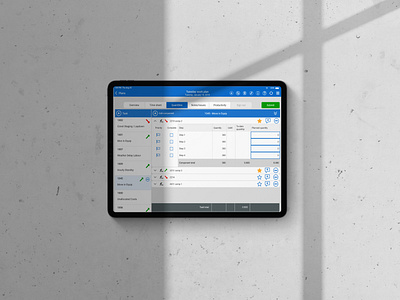
Favorite Component Final and Initial Designs
The first image here is the final design, the second image includes my first pen and paper wireframes, then the next three images are my first mockups where I did not include color.
After learning about this project, I began sketching up indicators. In the early stages of this project, the requirements changed and two indicators were requested instead of just one. One indicator had to be able to be toggled on and off by the user (as seen here) and the other indicator's would be positive or negative depending on if the user's project is on track for completion.
After sketching up low fidelity wireframes, I started to mock up designs in Axure 9. Here I was exploring different shapes and icons to indicate progress.
The InEight team requested some sort of visual indication that progress was claimed on a component to help with understanding at a glance.
Created at InEight Inc. in September 2019 for the Progress iOS iPad app.


