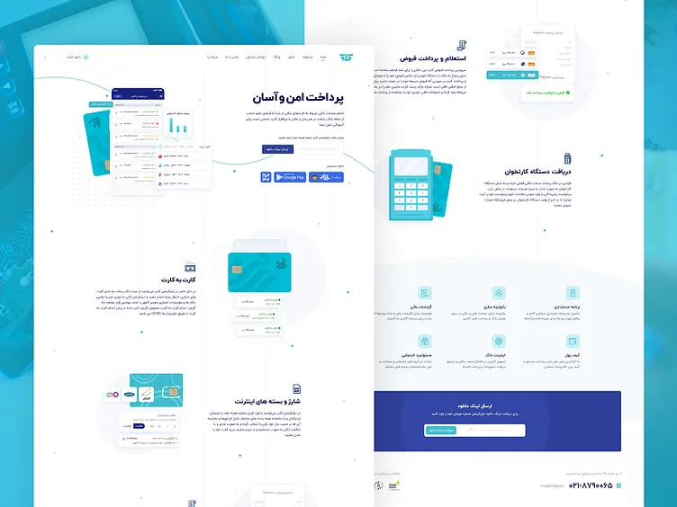
iCup - Landingpage
Hi Friends 👋 Over the past few months I’ve being working closely with a company called iCup on their branding, website and user product. They wanted their brand to feel young and modern since a lot of there current on-boarded users are below the age of 35yrs old. Something I struggled with on this project was trying to find the balance between playfulness and brand trust. After testing out different fonts and color scheme I came up with a teal to dark blue scheme that the client and myself felt good about moving forward with.
Attached you’ll find onboarding flows, web landing page design as well as the product and some modals that live within the product.
Hope you like it :) Feel free to feedback and comment. don't forget to press "L"
Thank you
