UGG Logo Mark Redesign

UGG Logo Redesign
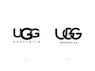
As many of you know now, my favorite design style is to play with letters and create monograms. I dont know how but till last week I havent notices howbad the UGG's logo was designed. I realized the logo when my wife wore her Ugg's. From a designer's perspective it looked very confusing..
Fist of all the logo used Serif fonts, which I believe dont match with the brand's overall product style. Its not a luxury brand but they create a product very well known with its superior comfort. Second, the mixed letters were very poorly designed and had to be fixed.
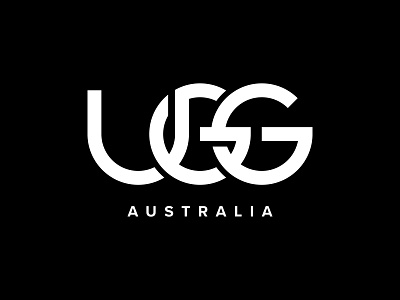
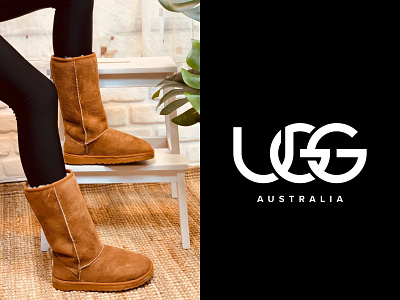
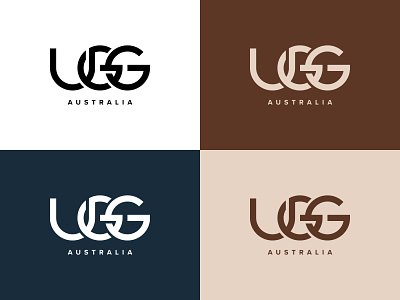
So I created a custom Sans Serif font and placed U, G, G letters with gaps so that even though its a 2D design, from a distance it looks like a letters are places like a chain passing through each other.
What do you think about this week's logo redesign challenge? Let me know your thoughts in comments.
Please Hit " L " if you liked my work, helps alot 🙏🏻 Thank you for your support..
------------
http://www.designermurat.com
hello@designermurat.com
Need a new logo design? Email me or visit my website to see all pricing and packages I am offering in detail..