Travel Agency Website
💌 Have a project idea? We are available for new projects info@ronasit.com | Telegram | WhatsApp | Facebook | Linkedin | Website
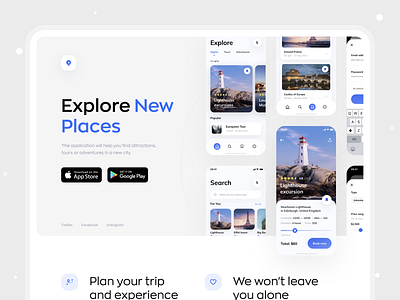
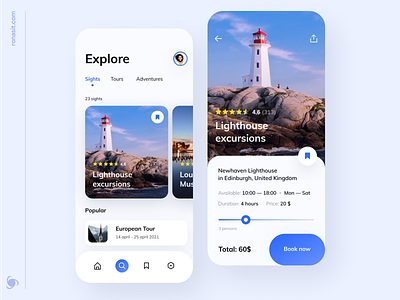
Do you remember our travel app exploration? It allows travelers to find new adventures and book exciting excursions and tours. Today we're sharing a concept of the app landing page.
This is a web site page that promotes our app. It gives an overall app description and features CTA to download the app from the markets.
The color palette is light with blue as an accent color. Blue brings up associations with a breezy ocean scene, a refreshing pool, the blue of Santorini's famous rooftops, clear sky, and many more.
This landing page uses the actual app screens as illustrations in order to give a user a clear understanding of what they are downloading.
This is the last post about our travel app! What do you think about our work?


