SoFi Money Redesign Concept - Rebound
I was really inspired by Phil Goodwin's refresh of SoFi Money. After being a user myself for a few years, I had plenty of thoughts on the layout and experience.
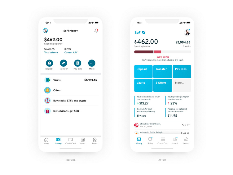
- I'm really looking for next-level insights on my budgeting. Each week of a budget is different. It would be great to compare specific weeks, not overall monthly spending. And I only want to compare my margin after recurring purchases (bills). Smart insights should save you the hassle of tracking individual line items.
- My purchase receipts shouldn't look like robot barf. I want to see the business name, logo, location, time, and some sort of detail breakdown of the purchase. The detail breakdown might not be available (yet), but I've seen services that offer much better tracking.
- SoFi's promos are so invasive... And you can't close them. They are a permanent piece of the layout. This makes the experience feel less personal and premium. It tells me the company doesn't really have my best interest in mind.
- I want to prioritize the money app screen. The home landing screen is a total waste of an extra tap. It's full of blog articles and promos when I need immediate access to my money. Marketing shouldn't be the first priority when using a mobile app.
- From a visual perspective, the entire page didn't seem very branded? I brought the logo and brand colors in.
(Nucleo for icons)