ShiftNudge / Typography / 10
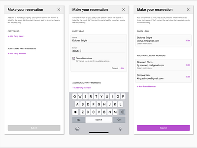
Interactive Text (Start)
(The primary color of the app (or whatever we're designing) is purple.)
When nothing has been entered, the Submit button is disabled. Also added a close button for leaving the flow! Actual design will depend on how this registration flow is embedded in a larger context.
--
Interactive Text (Add Party Lead)
The "Add" uses primary color for calling itself out, while "Cancel" is not, to have a lesser prominence.
This does lead to the question that "Cancel" is almost the same style as section header ("Party lead and "Additional party members") aside from casing differences. but since it's sitting next to "Add", we should be fine?
--
[Interactive Text (Participants Added)]
A view of list of participants, now with "Edit" interactive text and surfacing the dietary restrictions selection as a byline.
I chose to make email addresses the same font size as names, rationale being that emails are important — if they're wrong, members can't receive confirmation emails.
By the way, we're still using only a total of 4 font sizes: 24pt (screen header), 16pt (name/email address), 13px (section heads and interactive text), 12px (hint text).