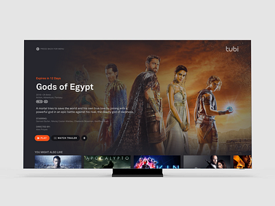
Tubi TV UI Refresh
I always like looking at different tv designs and seeing if I could put my twist on them. This week I was able to look into one of my favorite streaming services, Tubi, and re-imagine their movie user interface.
I tried to minimize the details that may be less important to the user but still give an overall sense of what the user needs to see in order to press that play button.
I would love to do a version where the back ground does an autoplay of the trailer and the foreground type would move out of the way in order for a user to make a choice in playing this content.
More by Ryan McCarthy View profile
Like


