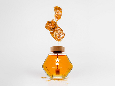
Bie | Branding & packaging
BIE is a student project for logo and packaging for honey.
The main task was to create a logo that would be related to the product itself.
The name BIE is a Norwegian word for bee. A stringing winged insect that collects nectar and pollen, produces wax and honey, and lives in large communities.
What is unique about BIE is the honey jar which is in the shape of a honeycomb. Almost all jars of honey come without spoons and it is more difficult to use because you use an ordinary spoon. So I created a package wherein the jar there is a wooden spoon for honey which is a kind of dropper and it's a way easier and proper way to eat honey.
More by Stilina Design Studio View profile
Like
