Bundles
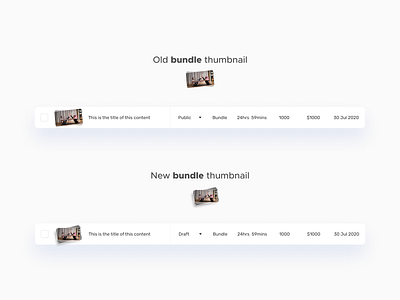
Here's a before and after on 2 iterations of the bundle thumbnail's appearance for FavYogis' media manager.
The new one has more items in the stack to show the bundle idea more clearly.
It also has a drop-shadow or box-shadow which elevates it from the background, making it distinct.
The items in the stack are no longer made up of repeating images but are now just solid grey variants.
Like and follow for more.
Contact me - efeativie@gmail.com
More by Oserefemhen Ativie View profile
Services by Oserefemhen Ativie
Like


