Perfect Place logo
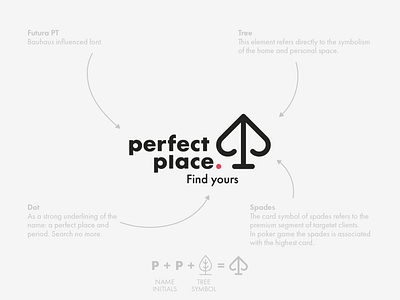
Logo designed for a real estate agency runs by two elegant women. When I was doing a research of the competition I saw that most of them looks just the same. A symbol of house or key implemented in logo is 90% of the solutions. I didn't wanted to do something ordinary, so I decided follow the way a described on the picture.
What do you think? Does it look like an original, premium and housing brand?