Honda automotive - design task
Honda automotive design task project
I recently completed a small design project for the second round of my interview. The challenge was to improve or redesign Honda's test drive booking system. I enjoyed it so much, I thought I would share how I conceptualised and sketched a shared storytelling user experience as a booking alternative, following the interaction design basic process.
## Establishing requirements. An initial desktop research and expert review was conducted into the current booking system primarily on mobile devices, iPad, iPhone prior to desktop, revealing six main improvement areas regarding, loading times, long form completion, lack of human error handling (back button), fragmented Breadcrumb process, search format flexibility and button design sizes. Further to this point the documentation included five improvement points and design alternatives.
A competitor review was also conducted, again on high level, providing this project with a broader perspective of opportunities.
User journey was sketched with friction points and improvement opportunities suggested thereby. A think aloud user testing followed to cross-referenced the findings and the persona created informed the design process further mainly by means of booking functionality at this early stage.
All the above high level user data gathered from the interviews and analysed looking for common and recurring themes in use, established the functional and design requirements of the booking system. ## Designing Alternatives Two design alternatives where sketched for mobile devices primarily in mind, since statistically the popularity of the users are accessing content this way. The first design alternative was a linear, more conservative booking process; whereas the second was circular and thus more futuristic.
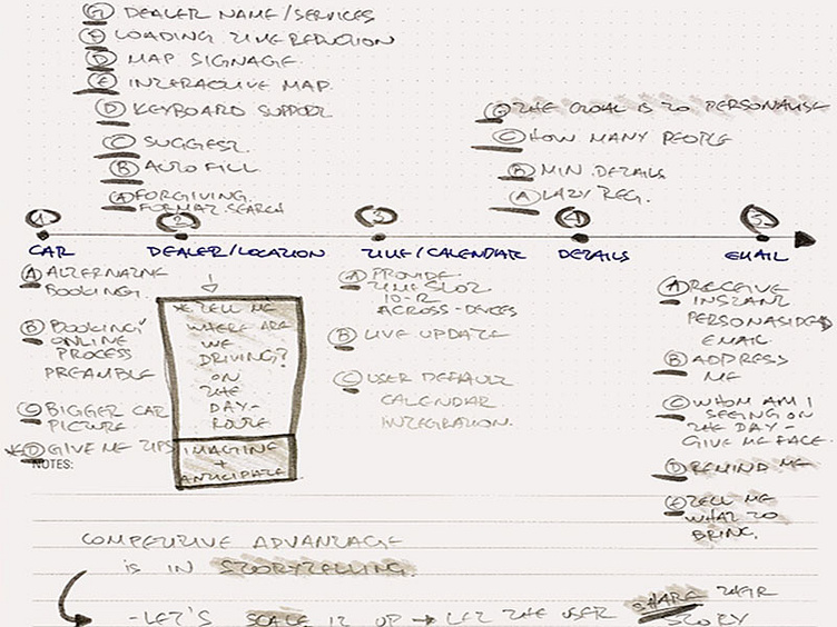
## Prototyping Four steps were defined and paper prototyped in the booking process and the users journey, namely car, location and time selections, following personal user input details form submission and finally receiving the email. In the first design the process remained linear, whereas in the circular the process was clock-wise.
In both design processes, the user first selects their contact options: phone, call back, online booking and their car of choice from two different models each time. Then, the map is loading fast providing basic local dealer contact information details and photos. The drive route is also included with pictures. Following that, a calendar view is simple, including live updates and integrating with the users calendar. Last, the user inputs their personal details in a "lazy registration format", informs the system of the number of people attending the test drive and submits the form. A personalised email is received providing the user with information about insurance, documentation requested on the day and the choice to re-schedule or cancel their appointment.
After the completion of the test drive the user is prompted by email to share their driving experience comments, video and images at Honda's social media and invite their friends and family to view, thus the overall test driving experience becomes a story to share with friends and family. ## Evaluating The evaluating process was not completed, however this would include feeding back the designed alternatives to the users in request for further feedback and insight, using a "wizard of oz" method, measuring the suggested system against its' set requirements on usability, accessibility and human error handling.
On the belief that interactive systems are alive organisms, bound to evolve and upgrade, I chose to include project trajectories for the client, by recycling and linking secondary conceptual design ideas and user preferences temporarily parked aside.
