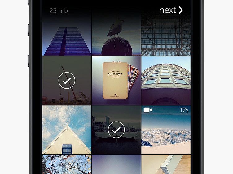
WeTransfer grid
This is what you see when you scroll through your photos and videos with WeTransfer for iPhone.
The sizes of the grid is copied from the horizontal mode in the iPhone's Music app, with 212 pixels per thumbnail and 2 pixels in between. It's a proportion that makes the content look very balanced and organised.
What catches the eye is the heavy black gradient behind the navigation bar. It's as if the thumbnails disappear into nothing. It wasn't an obvious choice, and it took a while before I've gotten used to it, but some looks take time to stick.
More by Joost van der Ree View profile
Like
