100 Days of UI - 006 - User Profile
Prompt:
"Design a user profile and be mindful of the most important data, names, imagery, placement, etc. Is it for a serious profile? A social profile? (It's up to you!) "
Solution:
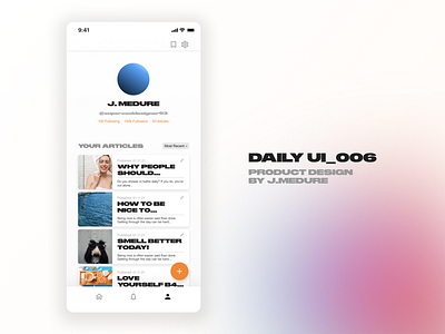
I've recently been trying to get better at writing and feel I need to put stuff out there and receive feedback, thus I've been getting familiar with the Medium UI and was inspired to make a profile page loosely based on there's.
This user profile page is essentially a writer's profile on a user-based writing site like Medium haha. It was important to me to maintain quick access to any of the blogs, thus the "Your Articles" filtering button - right now set to "Most Recent." Additionally, it was important for me to make it clear that clicking on each article meant the ability to also edit any article, thus the pencil/edit symbol on each card. The cards were tricky at first because I tried to make them more vertical, however, I realized if you're the one writing you probably are pretty familiar with your various works, so smaller indicators such as a smaller image and the intro to the title being visible and having more cards on the page without scrolling were more important features to me, putting myself in the shoes of the writer. Lastly, this is the user's home-base more or less so I wanted them to be able to edit or check out all of their settings in one place so I included the settings in the top right for easy access.
If you've got feedback for me, I'd love to hear it. Thank you for viewing. Here's my feedback
Personal Feedback:
- something about this is off to me. I think it may be a combination of font and spacing but thankful to have the opportunity to try again tomorrow! :)
