Markee Logo
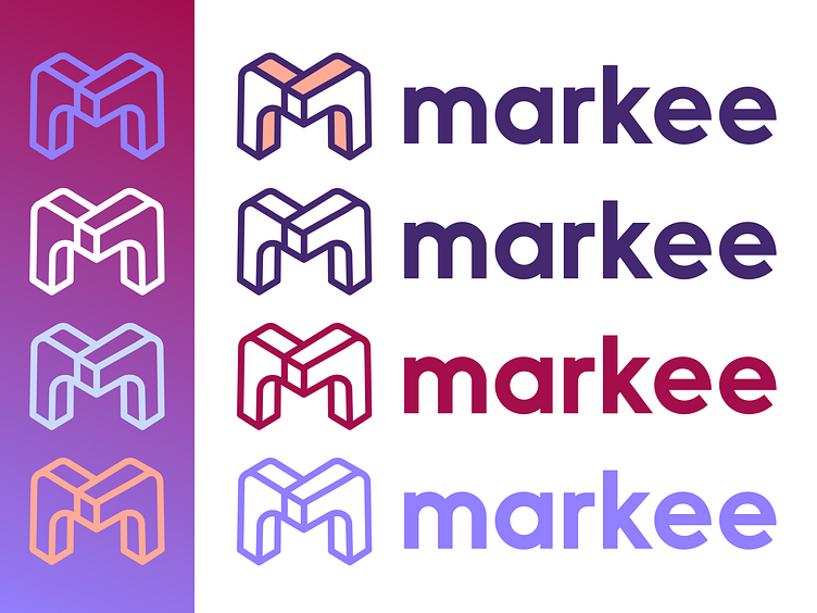


A closer look at the full logo and mark for Markee. The lowercase m proved to feel more approachable and not create the awkward spaces of an uppercase M, which created imbalance and visual conflict with the mark.
A cozy little meeting and event space to crawl into and call your own.
A closer look at the full logo and mark for Markee. The lowercase m proved to feel more approachable and not create the awkward spaces of an uppercase M, which created imbalance and visual conflict with the mark.
A cozy little meeting and event space to crawl into and call your own.