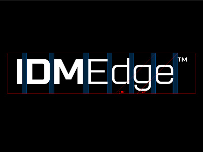
logo spacing guidelines for IDMEdge
IDMEdge Custom logotype and spacing
___
___
Thank you guys for all the support on Behance on the IDMEdge presentation 🎉 appreciations are 100+ already 🙌🏽
https://www.behance.net/gallery/112330419/IDMEdge-Corporate-Identity
_
The spacing between all letters is 1X and spacing between IDM and Edge is 1½X just to make the words separate.
45 degree line is used to connect logomark with wordmark and the other thing they are doing is they are signifying the word EDGE again just to connect the logo with a Custom wordmark.
___
Available for a new project.
Email or DM
Kanhaiyasharma.id@gmail.com
___
Let's Connect
💎 Instagram- Daily design & Logo grids.
✍🏻 Behance- Projects & Case studies.
📌 Medium- Share Experience & design resources.
More by Kanhaiya Sharma View profile
Like
