Pixelmatters • Homepage
Hi, fellow Dribbblers 🙂
We're sharing new behind the scenes of our rebranding, this time about our website restyle.
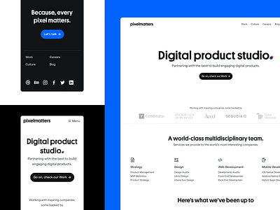
Along with the launch of the new brand, we also restyled our website to reflect our new identity.
The homepage needed to reflect this new mature brand. It's simple in a way, but it still stands out through the details. For example, the two contradictory orange and blue shapes overlapping, reminiscing the concept "Happy Contradictions".
More by Pixelmatters View profile
Like
