Captain Josh Hill
So after over a year, it's about time for another post. I have tons of work to update on my site but because it's way too daunting to tackle, I thought I'd start small. This is a custom logotype I started sometime last year but unfortunately the client has since completely disappeared, so the upside is that I can now do what I want with it.
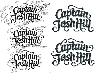
The original project was for a small rum business and the logo needed to have an adventurous, Caribbean, exotic, hand-made feel to it. The lettering was loosely influenced by cartography and the classic look of treasure maps. I aimed to mix informal script and blackletter styles, so tried to find the right degree of swashes, roundedness, curvature, etc. (rough work on left, bigger version attached).
One of the early digital versions (bottom right) had more swirls and more little details: small protruding strokes on the upper right stem of 'a', sharper corners, extended serif-like strokes on the 'H' and so on. The final version (upper right) was toned town a little more, but I did also refine the overall composition, especially the angle of the last name which I prefer here.
I'll be adding the project to my site soon and while I was originally leaning towards the first version, I'm not sure if it just looks a bit to cluttered. Would love any thoughts on that.

