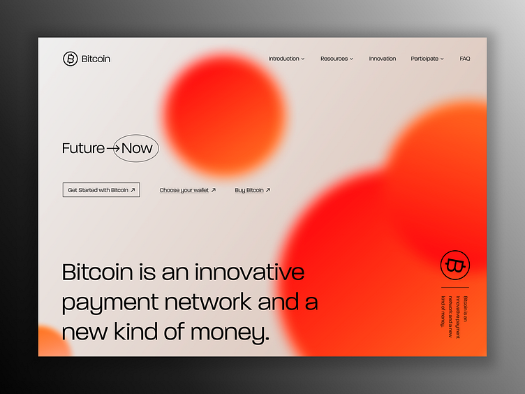
100 Days of UI - 003 - Landing Page
Prompt: "Design a Landing Page -- What's the main focus? Is it for a book, an album, a mobile app, a product? Consider important landing page elements (call-to-actions, clarity, etc.) "
Solution: Initially, I didn't want to do this challenge. I mean if you're anything like me you've made 10000000 landing pages and you're kind of over it. But then I decided well I don't have to make a typical one. So that's exactly what I did...I went for a landing page that didn't have a typical look to it and I'm happy with how it came out.
Ultimately landing pages are about effectiveness, right? So the challenge here was making something atypical while remaining effective. Granted, we'd have to do some testing to tell whether my landing page is still effective but I'm generally happy with it.
I used https://bitcoin.org 's current landing page, nav, and copy to make mine and did a bit of a redesign with a new logo projecting what felt a little bit cooler to me haha. I feel like bitcoin should feel cool and new and not so techy but just my opinion.
If you're curious I used the Paralucent font from adobe fonts which you can find here: https://fonts.adobe.com/fonts/paralucent
If you've got feedback for me, I'd love to hear it. Thank you for viewing. Here's my feedback
Personal Feedback: - I'm not IN LOVE with the gradient circles and they could use more texture but as a daily challenge, I think this is fine. If this were a work opportunity I would spend more time trying to figure that color and background out. But fun to practice nonetheless! :)
