Chartbuilder
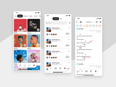
Everything felt hopeless when I opened up Figma to design this. We had had a long drawn out experience with a lousy contract designer who left us with UX full of holes and design that was lackluster. This redesign was a rare opportunity to rethink the app and its navigation during a significant technology change, and we were about to miss it. Our leadership was devastated by the dollars we had lost in this redesign, which was virtually worthless. Even worse, it was my fault for not catching it sooner. The new directive was to redevelop the app with the design that we had using the new technology. I couldn't let our glaring navigation problems and UX faux pas be REBUILT. After work for three weeks, I spent every day rebuilding the app from the ground up in Figma and doing useability tests in the hallways with coworkers on breaks. After those three weeks, I had mapped out every scenario and screen we needed to develop our MVP, and it was all user-tested. Our leadership team was pleased. This mockup is part of that big design project. Our design team only had to spend a few days pushing pixels and changing some hex codes before it would hit the assembly line full steam. Sometimes all you have is pure grit - and that will get you pretty far in life.
