Aves Lair New Website
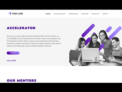


The old website was problematic in many ways. It was awkwardly and randomly colorful all over the place, the typography was erratic and used illegible fonts, and the graphics had none of the qualities we wanted to showcase—ie. we wanted them to look high-tech, professional, and intelligent. On the new website, I cleaned up the typography and color scheme by limiting all content to two professional fonts, and three shades of purple. As a result everything looked much more professional and consistent. For the images of urban cities used around the site, I used black and white images with color limited to a few areas fo the photo—this makes the color stand out more powerfully, and gives the site a sophisticated and creative aesthetic.