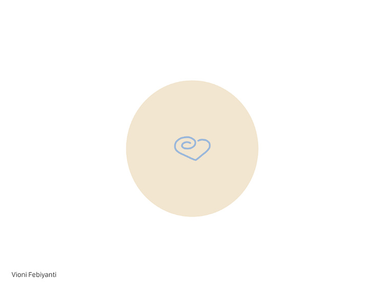
3rd Logo Design Concept - Kurimu Pafu
Third logo that I've ever made for fake Japanese bakery business scenario "Kurimu Pafu" that sells choux pastry (cream puff).
------------------------------------------------------------------
Idea How to represent the circular pattern on the top of the cream puff, represent the mascot’s hat pattern plus its body colour, represent the “K” from the brand name “Kurimu Pafu”, and represent the bakery vibe altogether. Imagine the “K” letter rotated 90 degrees and the straight line is erased. That’s how the “K” letter being integrated together with the heart and circular shape.
Execution Make the love, add the circular shape on one side of the love, add the circle to make it look like a whole.
Colour Beige colour to add the bakery vibe and blue colour to add the calmness and mascot vibe into it.
------------------------------------------------------------------
Please feel free to give feedbacks about the colour, design, and concept, thank you! ❤️
