Parking App Landing Page
💌 Have a project idea? We are available for new projects info@ronasit.com | Telegram | WhatsApp | Facebook | Linkedin | Website
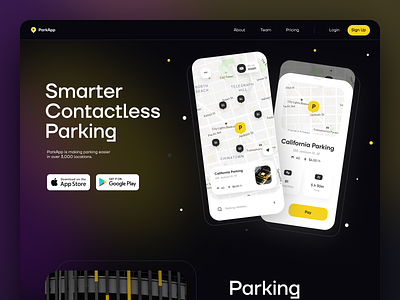
A landing page is an essential part of a marketing environment. Today we want to explore a landing page that promotes a parking app.
The shot shows the main page that contains an app description and features a call to action or CTA. On this landing page, the CTA is two buttons that invite a user to download the app in the App Store or in Google Play.
We used the brand color scheme of the app and employed a dark mode to create a user-friendly environment.
Usually one has to scroll to the bottom of a landing page to see the CTA. This way is thought to engage the user and persuade them to make the expected action by giving more useful information before showing the CTA. However, putting it at the top of the page feels like a nice change and catches the user's attention immediately when opening the page.
Do you put the CTA at the top or bottom of a landing page?


