2nd Logo Design Concept - Kurimu Pafu
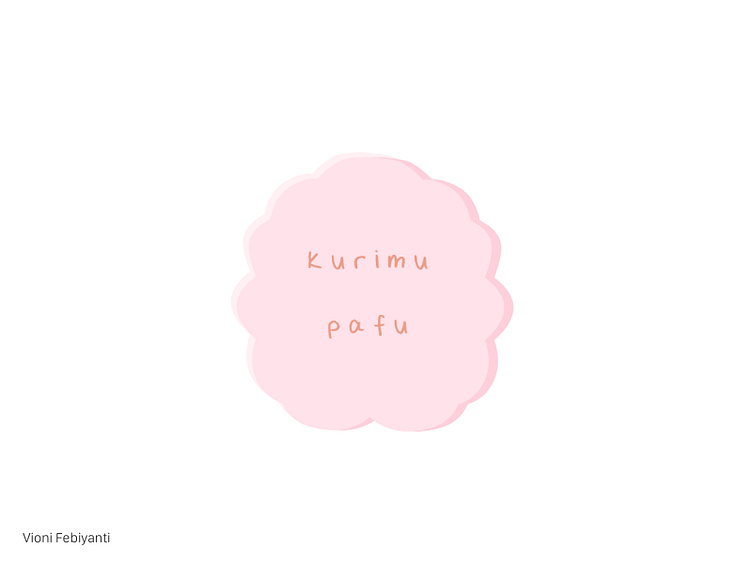
Second logo that I've ever made for fake Japanese bakery business scenario "Kurimu Pafu" that sells choux pastry (cream puff).
------------------------------------------------------------------
Idea How to represent the “puffiness” of cream puff (choux pastry), Japanese kawaii-vibe, and represent the mascot’s silhouette altogether.
Execution Make the puffy circle shape and add some texture near it to make it look realistic but fluffy at the same time.
Colour Pink sakura colour to add the cuteness vibe into the logo.
Text Use hand-written like typeface and add some space between the characters to make it looks like Japanese characters.
------------------------------------------------------------------
Please feel free to give feedbacks about the colour, design, and concept, thank you! ❤️