Colour Picker
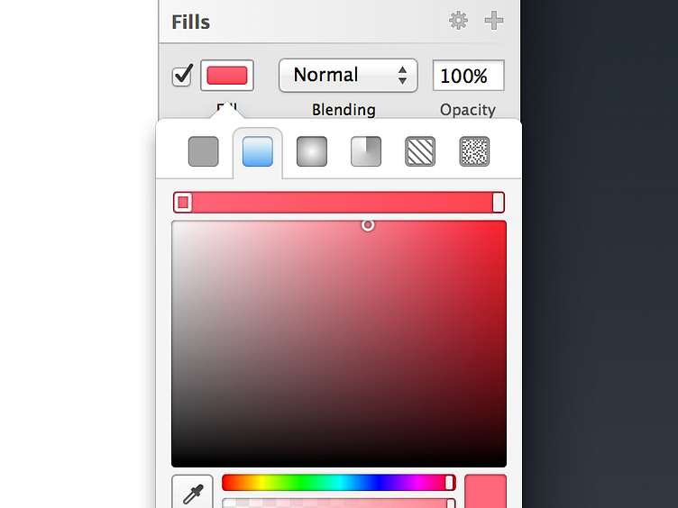
I wanted to make the inspector in Sketch 3 a lot cleaner, whilst not taking anything away from it. The transition from Inspector to colour picker wasn't one I was particularly fond of, so I wanted to make it more lightweight. And I thought a popover would be best for this. A lot of different ideas were tried, but this felt like it was the best option.
Along the top are icons to access different fill types, to ensure they can be changed with one click. Noise is now a fill type, and you get to see a linear overview of your gradient inline.
Pro tip: When a third(+) stop is added and selected here, you can position it using 0-9
More by Christopher Downer View profile
Like
