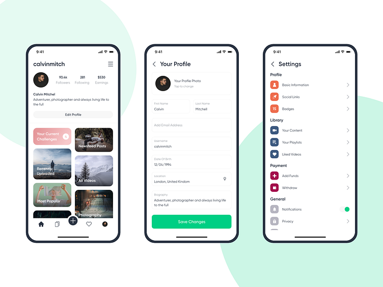
Profile
When creating the profile section for this project, I wanted to go for something that is familiar to users, yet offers something new, and keeps things in-line with the rest of the app's flow. The main profile page is fairly standard when it comes to the metrics, bio & username, but when it came to the rest of the profile, I wanted to come up with something different.
This app is a user-driven app, with a card-based layout used heavily throughout. This is something I wanted to capture, and as the user profile contained a lot of information of videos & images, I wanted to find a way that kept the card layout, whilst simplifying the process of finding what you, and other users want to find.
Keeping key information at the top of the list of cards ensures a positive user experience, as most frequently used aspects of the profile should be at the top easily accessible.
