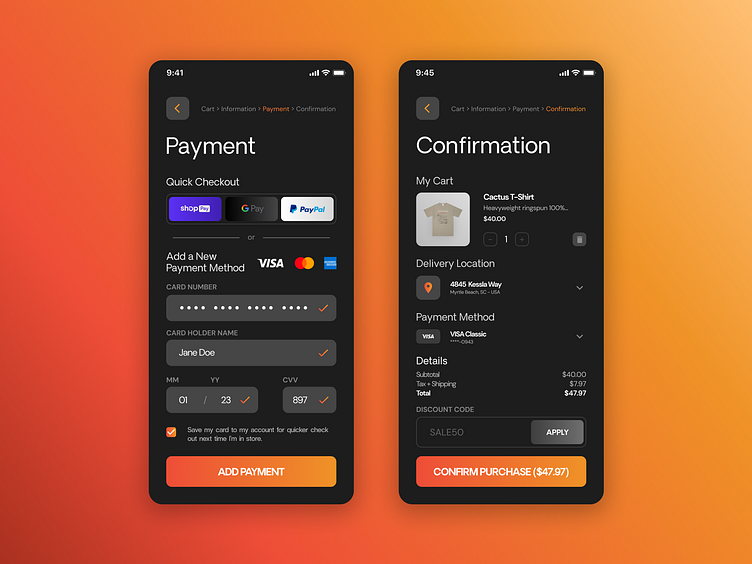
100 Days of UI - 002 - Credit Card Checkout
Prompt: "Design a credit card checkout form or page. Don't forget the important elements such as the numbers, dates, security numbers, etc."
Solution: Other than an exercise in spacing, type, and making sure all fields were accounted for in the checkout process. I wanted to practice my dark UI capabilities and wanted to make sure I was mindful of current quick checkout methods as well as applying discount codes. My thought for the discount code is the button will light up like the confirm purchase one when the coupon code is approved and you may then select it. The page will refresh and a new line will go before total applying the discount.
Another thing that I think is really important that I didn't see in a lot of the examples I was looking through before I started this project, was the page navigation at the very top. The checkout process is one of the processes we're all used to but having visual feedback to know where you're at in the sometimes long process, is nice to have as a user, in my opinion.
If you've got feedback for me, I'd love to hear it. Thank you for viewing. Here's my feedback
Personal Feedback: - I think the google pay button is a stretch as far as readability/usability for all is concerned and I should probably revisit that given the opportunity to do this project again. - I think maybe the typography and spacing could use some love. Although pretty and what I think is still functional, everything still feels a bit cramped.
