Classic Music App
As an exercise I had to make the layout of three screens of a hypothetical classical music app and I had 24 hours to finish them.
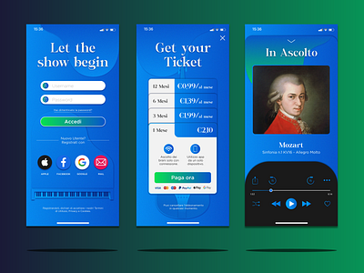
I used a very particular font with connection between some letters, which reminds the musical scale. As a background I used a blue gradient with illustrations of musical objects in 3d.
There are also some elements in green, especially in the buttons.
What do you think about it? Let me know!
