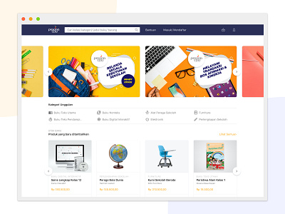
SIPLah pesonaedu preview
Designed for what matters
Focus on usability and accessibility. I don’t do much aesthetic treatment, instead I just focus on make a good contrast of every elements and actions (CTAs, links, etc.) that enhance clarity of the website. This website is already a set of high complexity. I thought it won’t be right to make it looks fancy - as it add some more complexity by look and feel. I aim for ‘just-right’ look and feel - not too much, yet not too less.
Full study case on https://www.behance.net/gallery/92563223/SIPLah-Pesona-Edu-School-Supplies-Marketplace
More by Thomas Khogeen View profile
Like
