barometer — reports design (multipage layout)


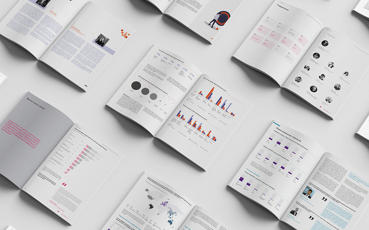


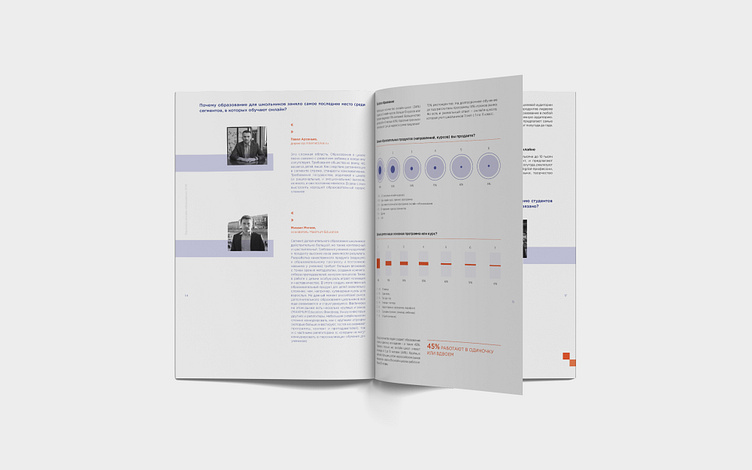


One of our regular clients whom we have been cooperating with for several years is the Barometer research project. The company is specialized in investment and creative market-analysis since 2014.
In every client’s project, we translated big chunks of text and tables into a simple visual language of communication, added explanatory illustrations, compiled laconic graphs and diagrams, and explained many parameters and complex numbers in an understandable manner. This all helps investors and startup founders to easily understand each other and to clearly discover their needs and expectations.
Our strategic decision was the choice of a common format for research as “periodicals”, which were complemented, in each following report, with their own unique color-code. A consistent color palette is used for all graphic elements within a particular direction.
Through stylistic techniques and detailed visual concepts, we helped Barometer to realize their main goal in creating applied research. As a result, competently packaged information allows readers to not only conclude the current processes, but to also contribute to the development of the studied industries.
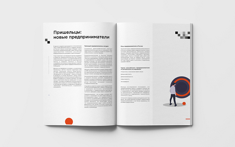
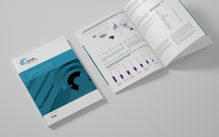
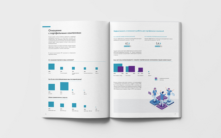
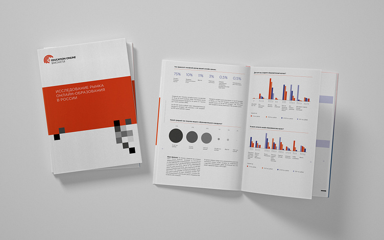
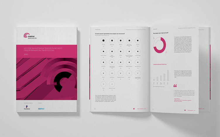
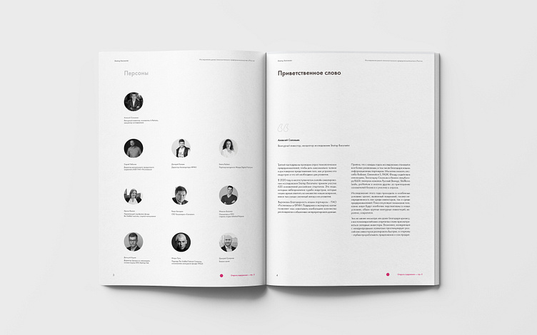