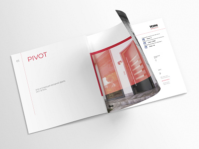
tehni doors — catalog design
TEHNi is premium doors with a comprehensive theft-protection, coupled with elegance, and evolving from the classic design to a modern one. For a long time, clients got used to only having their logos alone without a formed brand identity. Here, we set the design direction for positioning the entire brand.
While making the project, we set the goal of convincing the client’s buyers of their safety when they’re choosing the company's products. The functionality of the doors comprises minimalism and focus on important details. As in all our projects, while developing that catalog, we implemented the principle of modularity and used a grid in-which all graphic elements were pinned. A clear structure without unnecessary information explains to the client the functionality of each door presented in the catalog. We added the red color as an aggressive accent to draw attention and prevent theft attempts. At the same time, clarity shows the reliability of the client’s product, puts aside the doubts in their choice.
We have developed a catalog meeting the client's expectations, helping their company to stand out from its competitors in today’s touch business sector.


