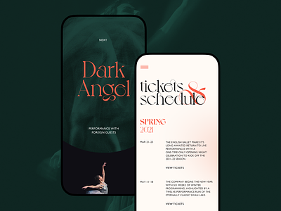
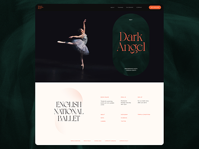
Ballet Company Mobile Website
Take another look at the website design concept full of powerful grace and aimed at strengthening the online presence of a ballet company. The design approach is based on bold impressive typography, prominent and elegant photo content, solid visual hierarchy, and color palette creating the instant feeling of lights switching off in the hall of performance. And here you can see how it looks in a mobile version. Stay tuned to see more!
Also, welcome to read more about types of images in web interfaces, learn how to reach design consistency, and review the guide into basic types of web pages.
More by tubik View profile
Services by tubik
Like

