Canada Goose Logo Redesign
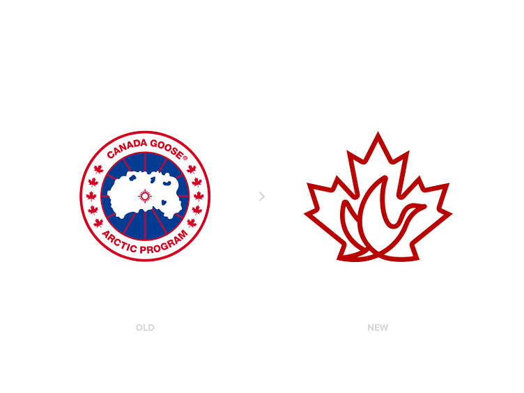


Canada Goose is one of the iconic fashion brands. The logo looks very outdated but according to owner, they wanted to symbolize a logo that would make you feel like you are in a special community club when you wear one of their creations.. To be honest, I liked the idea behind, but thought we may create a logo and still use it as a patch as well..
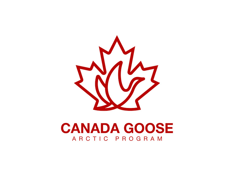
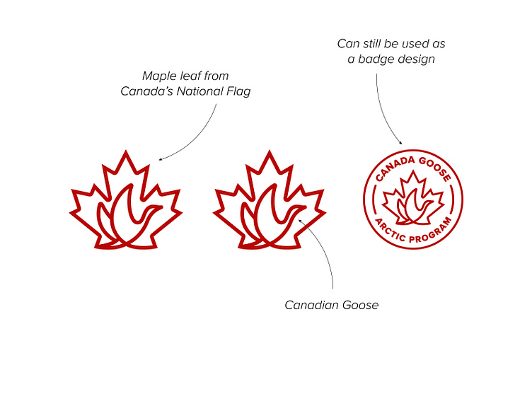
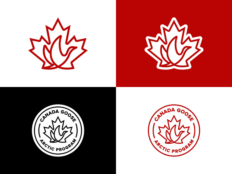
What I did was to combine maple leaf from Canada's flag and a flying canadian goose together.. When I started working on this branding, I wanted to create a negative space goose inside the maple leaf but while working on it, I tried line art and it came out much better than expected.. I also create a patch design using the new mark.
I know some of you will say that the old logo had much more meanings inside.. First of all, those were also complicating the logo which I thought was not a trend of this century.. Still I could find a way to combine all better, but I am not being paid now right? 🙃
PS: When I think about the logo, it may also be used as a branding for Air Canada right? 👌🏻✈️
Let me know what you think in the comments.. Please Hit " L " if you liked my work, helps alot 🙏🏻 Thank you for your support.. ------------ http://www.designermurat.com hello@designermurat.com Need a new logo design? Email me or visit my website to see all pricing and packages I am offering in detail..