Betterbank.app


+Project Scope
This is a Redesign Project for Betterbank.app. It's a Banking + Community Safety Net Application that aims to fight unexpected medical debt.
+Direct Contribution
Aside from giving a fresh look for the current UI I was hired to design the necessary features for the MVP. Also was tasked to established the brand design system and create prototypes and UI animations for the dev team.
+Design Rationale
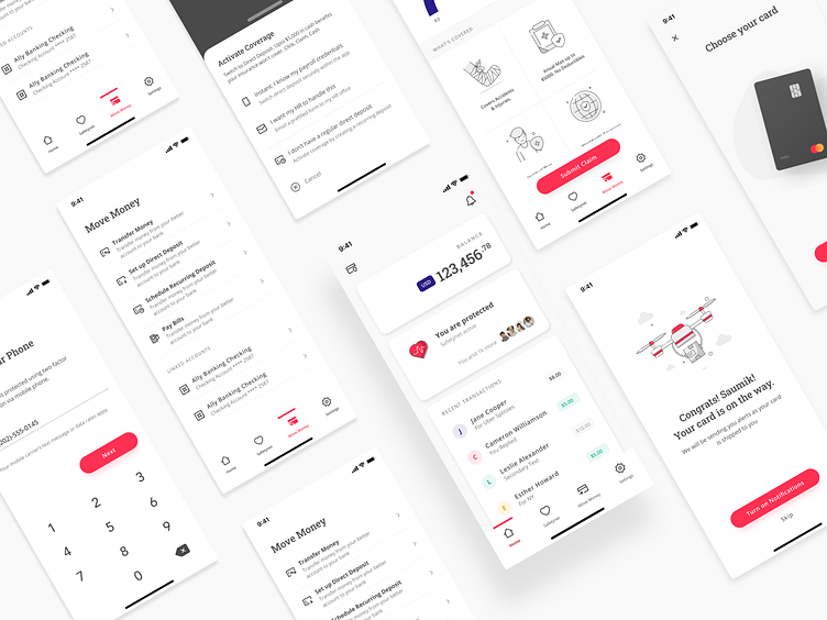
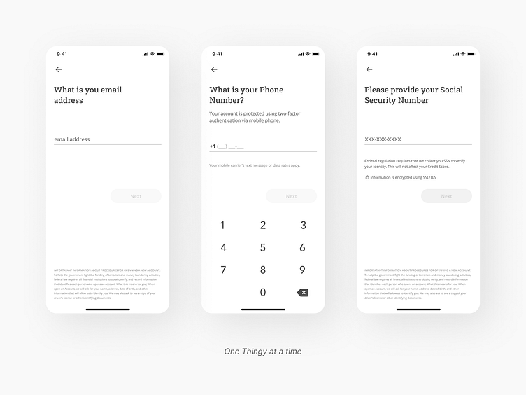
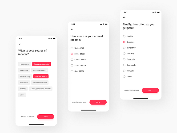
✈ Onboarding - One of the challenges we have to the long process of onboarding since we require a lot of requirements. We resolved this by using the “One Thingy Per Page” approach which basically splitting up complex process into multiple smaller pieces and placing those on screens of their own.
It reduces cognative load, handling errors is easier, loads faster, tracking behaviour is easier, scrolling is reduced or eliminated, and it adds a better sense of progression.
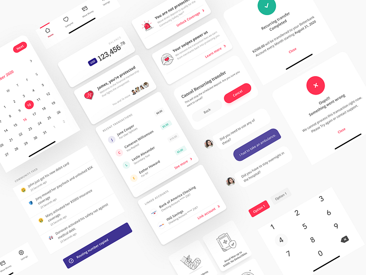
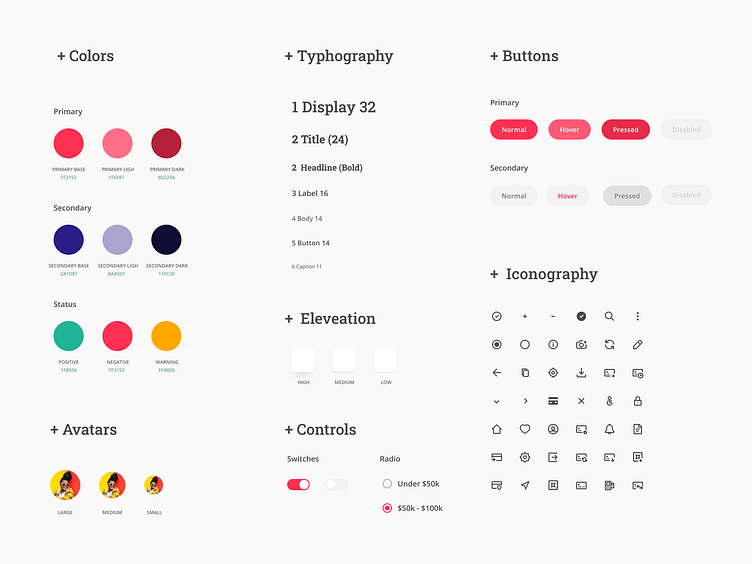
🎨 Design System - I was also tasked to create the base design system so they can keep the consistency and scale the product design efficiently,
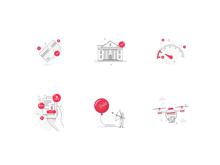
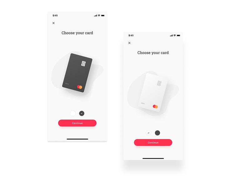
We wanted lean away from the usual look and feel of finacial apps, we wanted to have this friendly/community vibe. Thats why we chose Serif font, lined icons and illustrations, and rounded components.
🏃♀️ Motions - We also invested in animating some of the elements to emphasize and boost sense of progress.
+Project Scope
This is a Redesign Project for Betterbank.app. It's a Banking + Community Safety Net Application that aims to fight unexpected medical debt.
+Direct Contribution
Aside from giving a fresh look for the current UI I was hired to design the necessary features for the MVP. Also was tasked to established the brand design system and create prototypes and UI animations for the dev team.
+Design Rationale
✈ Onboarding - One of the challenges we have to the long process of onboarding since we require a lot of requirements. We resolved this by using the “One Thingy Per Page” approach which basically splitting up complex process into multiple smaller pieces and placing those on screens of their own.
It reduces cognative load, handling errors is easier, loads faster, tracking behaviour is easier, scrolling is reduced or eliminated, and it adds a better sense of progression.
🎨 Design System - I was also tasked to create the base design system so they can keep the consistency and scale the product design efficiently,
We wanted lean away from the usual look and feel of finacial apps, we wanted to have this friendly/community vibe. Thats why we chose Serif font, lined icons and illustrations, and rounded components.
🏃♀️ Motions - We also invested in animating some of the elements to emphasize and boost sense of progress.
