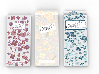
chocolate packaging
This is one of my proudest assignments that I completed while I was in school. First, we had to measure out the box we wanted to create the template from, so what we had to do was find a box that fit our plan.
Once we had the box we had to make it flat and measure the border of the box. We also went back and measured the shapes that are naturally made inside the box. That was so we could place the fold lines in the right spots in the template.
Once I had all of that laid out we had to make sure that all of the cut lines were joined together otherwise we wouldn't be able to cut it out on the machine. After our practice cuts were approved by my professor we then started on our final project for the package design class.
One of the challenges was coming up with what our packages would be for once we were finished. I decided on chocolate. Basically, I love all of the vintage packaging that chocolate has now.
From my own inspiration, I created a mood board for the package designs. Once I had my mood board finished I decided on a flower pattern. I chose muted colors so it would add to the vintage style I was going for. I used Photoshop to design the pattern.
Then I brought the patterns into my die line cuts for the packaging. It was also helpful to have a package example when I had to make up the ingredients and things that typically go on a package.
This project was the first project that introduced me to making a mood board. I always use to just dive right into a project, but this taught me to do the research and find the inspiration to make a project what I wanted it to be. Plus it helps you to be hella organized. 👍🏼


