Linkedin UI
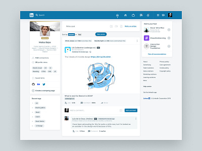
After a thoroughly review of Linkedin UI this is the result of not only a design elements review, to make them look clear and understandable.
Also after some user input some cleanup was made, many elements where wrapped to make them stand out and more readable.
The final result is a cleaner clearer UI that looks pleasant to the users.
I can help your project with UX, UI & Branding.
Need help with your next project?
Reach me at hello@matmac.design
More by Matias Bejas View profile
Like


