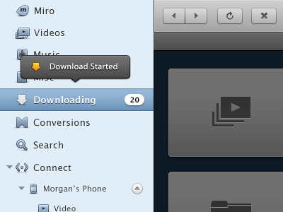
Miro 4's new UI and UX bits
We're getting really close to releasing Miro 4. I just made this Download Started popup. The rest of the UI in the image has come together over the last 6 months.
You can find older iterations of much of this stuff in my past shots.
The phone icon was incredibly difficult. Also, I'm very partial to my tiny eject button.
More by Morgan Allan Knutson View profile
Like
