Organic Skincare Packaging
The case when the rough differentiating from the competitors won’t work for you.
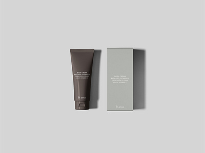
When creating a Brand Identity, there is always a task to induce the brand’s loyalty and to build trust between the brand and the customer through the design. It’s especially significant in the skincare niche. The brands that produce skincare products take the responsibility for their target group’s health in advance by offering them the cosmetics they need. So it’s extremely important to look (and be) trustworthy.
An interesting fact that a 27+ Le Sens’ target group tend to not be frequently experimenting with the cosmetic products as if they find the ones that work for them well they most likely stop considering other brands. So the task was not to get differentiated from the competitors, but to look like other reliable skincare brands that the target audience uses. Thus, it was decided to develop a minimalist brand identity with a classical packaging design, a sans serif font, and a non-aggressive color palette.
Need a brand identity?
Feel free contacting me / contact@katezest.com
