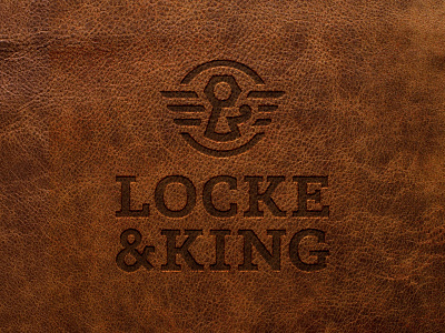
Locke & King Logo
Locke & King is a Canadian timepiece and accessories company based in Hamilton ON, combining classic inspiration with modern touches, with a portion of every watch sold going to Right To Play Canada.
The final icon incorporates elements derived from the company name that pay tribute to the overarching theme of the brand narrative that revolves around Hamilton and its significance. The custom ampersand was strategically mapped out to hint at suggestive visuals that tie back to the brand's ethos. The hex nut refers back to Hamilton's historic industrial importance as a leading steel manufacturing metropolis, which the city's character was built around. The lower half was designed to form the silhouette of a keyhole shape to allude to the idea of unlocking your full potential when using your time wisely. The flourish that extends to the right was introduced to break up the rigid rules of the mark and add a bit more regality. The wings were incorporated to add a sense of elegance, while leaning into the "Time flies" idiom.
