Versus.legal
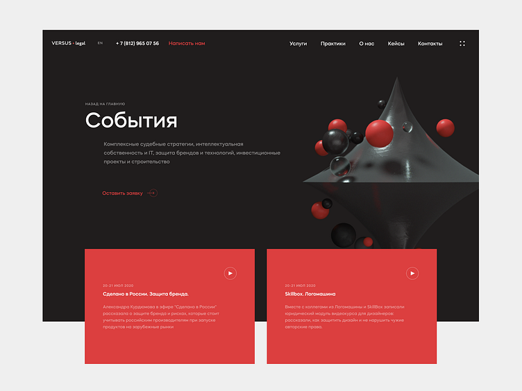
The company’s signature red color scheme was darkened to a noble burgundy, while the black was slightly lightened to maintain balance. We made the 3D objects stand out with realistic shadows, giving the site a noir feel, and used high-quality resources for objects and surfaces.
See more of our work → behance.net/nimax
More by Nimax View profile
Like
