Don Balbino Blanco
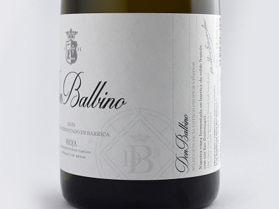
Don Balbino family winery needed a complete renovation of its image, to return to the market with its own wines after decades of dedicating itself to bulk sales.
We did a restyling of the logo to update it without going to an excessively modern aesthetic, trying to preserve the character of the previous brand, as well as its shield, which we simplified but wanted to keep.
The Puentegrijos and Don Balbino Blanco labels retain the same tones, to unify the brand, and also distribute corporate seals in their designs to reinforce Don Balbino's presence.
Here is Don Balbino Blanco, please, leave us your opinion!
:
