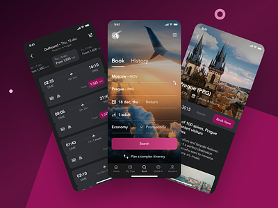
Qatar Airways Mobile App Redesign
💌 Have a project idea? We are available for new projects info@ronasit.com | Telegram | WhatsApp | Facebook | Linkedin | Website
With traveling still on hold, we cannot but miss plane trips. We've had a small experiment re-thinking the Qatar Airways mobile app where the company advertises its flights and destinations that you can visit flying with this airline.
The shot shows a re-invented plane ticket search flow, a search result page sorted out by the shortest time travel, and a destination info page. We kept the color scheme of the existing app but switched to a dark mode. We've been sticking to the dark mode recently because it is eye-friendly and gives an extra sleek look.
What's new? Our re-vamp offers to compare the prices on different dates without having to search the flights for every single date. The comparison bar is placed on top of the search result page. We extended a destination info page by adding more description and brand elements.
Do you use airplane companies' apps or flight search aggregators?


