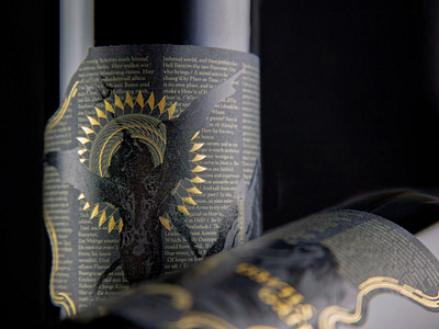
Devils Gate Wine Works
Closeup showing the typography. Using a single spot color for the ink on this label (metallic Pantone) was super important because otherwise we'd have to deal with registration on some very small type.
More by Lindsay View profile
Like
