Station Salon Logo Design

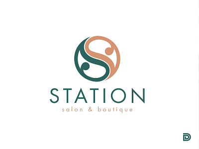


This is a case study for Station Salon in Encinitas, CA. This project was a great deal of fun to work on and I just want to share it with the community to inspire creativity in others and even possibly attract a few new clients who may appreciate this piece. Station Salon was a fun project, the owner of the salon and I were on the same page right from the get-go. She already had colors she wanted to use which have a beach boho feel since her salon location is just blocks from the beach, right on Hwy 101 in the heart of Encinitas, CA. She wanted something that integrated the two "S"'s and had a "ying-yang" balance to it. She needed her logo to have the flexibility to be embroidered or screen printed on apparel such as t-shirts and reusable bags, but also have the ability to be embroidered on aprons and hats. She will also be using this icon for street signage, website banners and social media imagery.
I went to work and came up with several sketch ideas for her. After showing her some ideas, she picked this logo right off the bat. She said, and I quote, "It's as if I read her mind." It doesn't always go this smooth, but it's always nice when it just clicks that first round. I took the sketch into Adobe Illustrator and finished it up.
Just a bit of imagery you get out of this logo, the split down the middle of the "S" gives the feel that there are two of them there for "Station Salon", the ying-yang symbol of balance is prominent in the piece, the line down the middle of the piece also represents the Highway 101 where the business is located. The waviness of the middle also has a flowing hair feeling to it, and if you really stretch your imagination to the limits, you can see two Koi fish swimming in a circle smiling.
The client was really happy with the results and I look forward to partnering with her again on several future projects she has in store.