Sneakin' - Logo Redesign
I had the chance to redesign a new logo and style guide for https://www.sneakin-shop.com/nl/
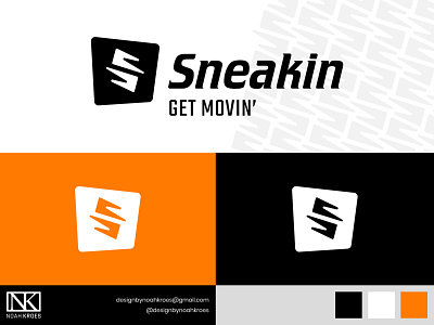
Sneakin is a company that mainly sells exclusive sneakers and apparel. 👟
In this shot I would like to showcase the logo from the project.
The icon represents the vision of the company. Two small elements forming the letter S, which is shown on top of a dynamic square.
It is based on the footprints you leave behind when you walk. This stands for progression, one of the brand values of Sneakin.
GET MOVIN’ is the new tagline which goes hand in hand with the vision of Sneakin, this is something I came up with along with some other ideas.
The redesign of the logo is part of a complete new visual identity we made.
Please let me know what you think! Any comment is very much appriciated.
Let’s work together! Feel free to reach out via DM or e-mail. ⚡️
