Hollard website research

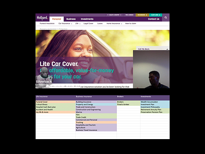
Hollard insurance required a total redesign of their public facing website. This included an overhaul of the navigation and content flow.
My approach.
I created a UX strategy via interviews with stakeholders in order to understand all business goals and success metrics.
I implemented targeted analytics.
Performed user testing on the current website as well as card sorting to simplify the navigation system.
I then created wireframes and tested them with users, after testing I prioritised findings and worked with the development team throughout all sprints.
I didn't work directly on the UI but was involved in brainstorms and all stages of the UI development.
Major outcomes.
Navigation choices were ordered in the most logical or task-oriented manner, which allowed users to complete tasks quicker.
By just looking at the home page, the first time user understands where to start their desired journey / task.
Products choices were reduced or the 2 main choices were displayed first to avoid product confusion.
Quoting forms were simplified and steps reduced to ensure quicker form completion.